CLIENT
Ovac Restaurant, Cavo Tagoo Santorini
LOCATION
Santorini, Greece
SERVICES
Brand naming, logo design, menus, business cards, print ad
YEAR
2017
The Story
Cavo Tagoo Santorini is one of Greece’s most iconic luxury hotels, a Cycladic masterpiece that mirrors the cosmopolitan essence of its Mykonos counterpart. With breathtaking caldera views and a reputation as a dream honeymoon destination, the hotel needed a restaurant that matched its prestige.
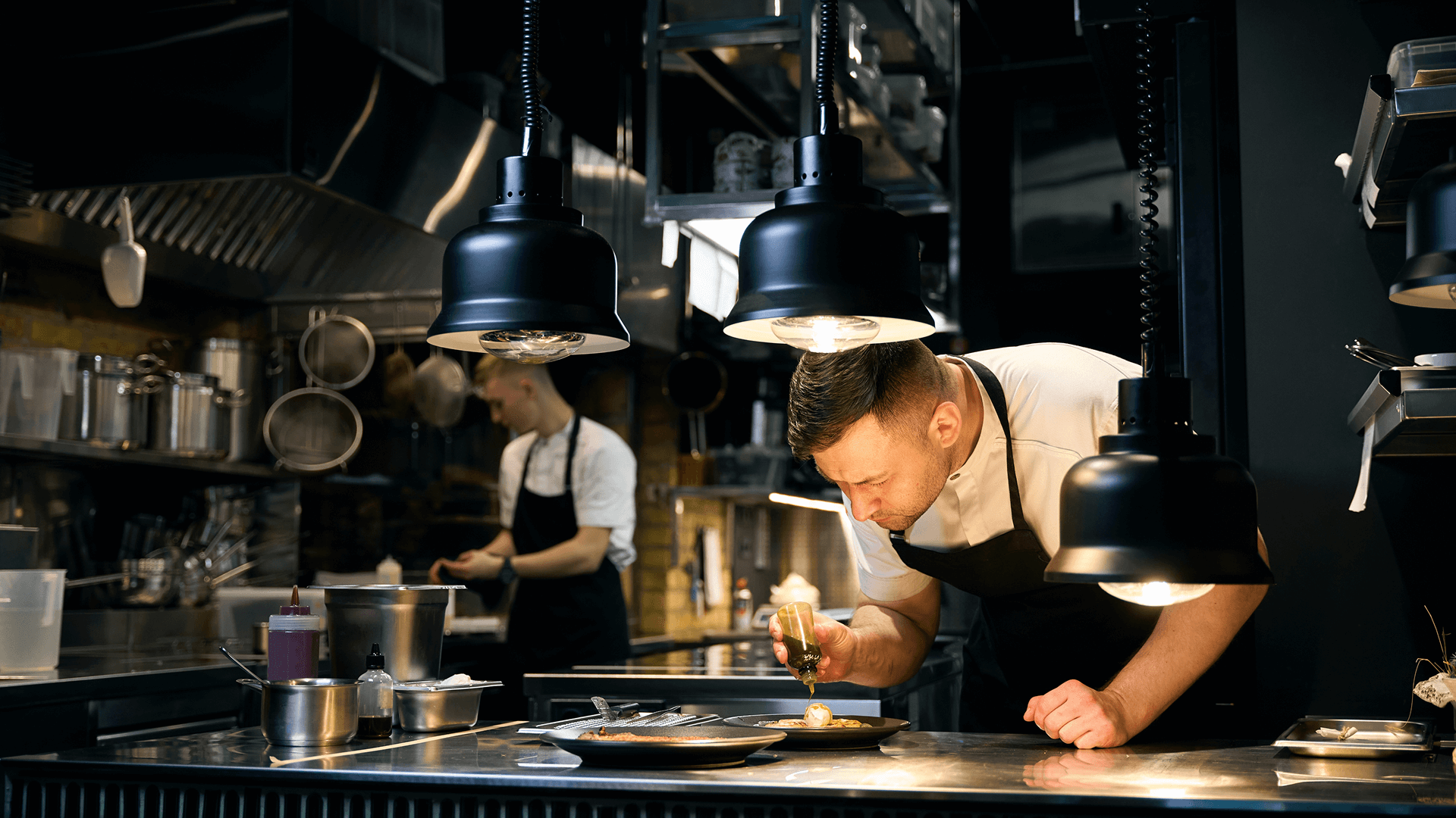
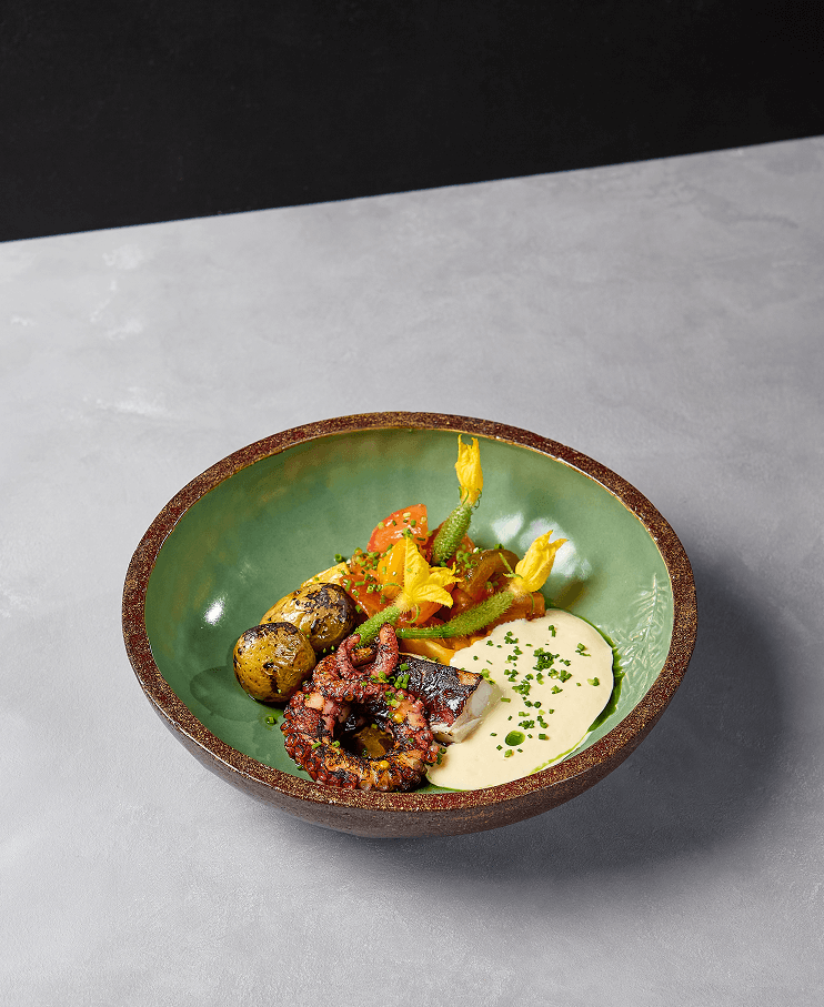
Enter Ovac Restaurant—a culinary haven offering Mediterranean fusion cuisine, served against the backdrop of the endless Aegean blue.

The Challenge
As a newcomer to Santorini’s competitive gastronomy scene, the restaurant required a distinctive identity that would resonate with guests while remaining visually connected to the parent brand, Cavo Tagoo.
Scope of work:
- Develop a memorable brand name
- Design a logo aligned with Cavo Tagoo’s identity
- Create menus and business cards
- Produce a print ad to build awareness


Strategy & Insight
Naming a restaurant within such a prestigious hotel demanded simplicity, elegance, and memorability. After extensive brainstorming, inspiration struck: reversing the hotel’s name resulted in Ovac—a refined, visually appealing brand that carried the sophistication of its parent while standing proudly on its own.
The logo was designed with the same thin, elegant font as Cavo Tagoo, ensuring visual continuity and a delicate, cosmopolitan feel.
Brand Naming & Logo
- Name: “Ovac” — a clever reversal of “Cavo” that feels fresh yet familiar
- Logo: Thin, elegant typography, visually tied to Cavo Tagoo’s brand identity


Restaurant Menus
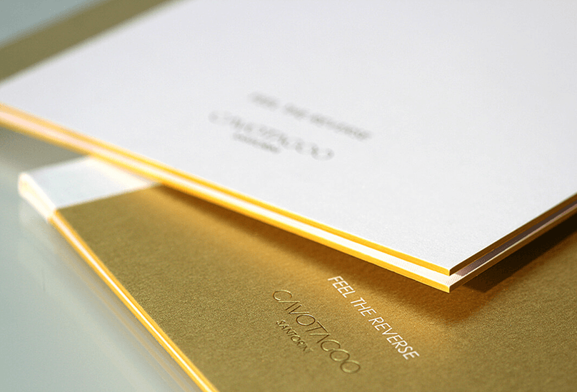
- Crafted from gold-laminated paper for prestige and durability
- Three hardcover menus designed in combinations of gold and white
- Materials chosen to reflect luxury and align with the restaurant’s elevated experience
Print Ad
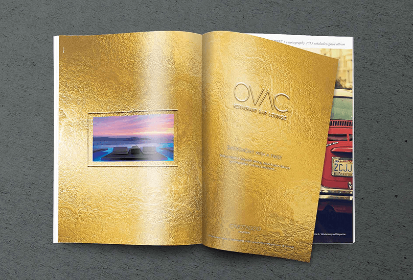
- Designed with a gold-textured background to capture attention
- Visual consistency with the menus reinforced brand recognition
- Elegant simplicity ensured the ad stood out in premium publications
Reflections
Ovac was a project where naming, design, and materiality converged to create a brand as refined as its setting. By connecting the restaurant’s identity to Cavo Tagoo while giving it a distinct voice, we helped establish Ovac as a gastronomic destination worthy of Santorini’s luxury landscape.
Let’s Craft Your Brand
Inspired by Ovac’s transformation? Let’s craft a name and identity that resonates.
Contact us or explore more of our case studies.
